

The Romance between Television and Illustration
For a long time, children's television programs in the Netherlands weren't animated, like in Japan or the US. Instead, they were illustrated.
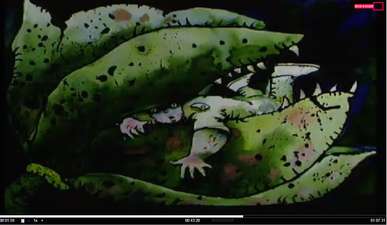
A fairy and a goblin fell in love, but they weren’t allowed to marry. After all: he was a goblin, and she a fairy, and that just doesn’t go together, right? This little story, that vaguely resembles Shakespeare’s Romeo and Juliet, aired on Dutch national television on November 14th in 1962. The item was part of a program called Uit oma’s kabinet (From grandma’s cabinet, NCRV), in which a grandmother, played by Martine Crefcoeur, opens a cabinet drawer and out comes a story. This particular item of the fairy and the goblin was accompanied by simple yet adorable black and white drawings, made by Johan Volkerijk. No animations were made because for some decades that was too expensive for the Duthc broadcasting companies. Instead, the Dutch youth television history is one of non-moving illustrations that were shown almost as if they were made for a children’s book, but were in fact made specifically for television.

Uit Oma’s Kabinet, Het elfje en het aardmannetje, NCRV, 1962, Screenshot taken from the digitalised program at the Dutch Institute for Sound and Vision
The idea of non-moving drawings for a moving medium like television seems strange. Does that even work? As it turns out, these illustrations have adapted to certain medium-specific characteristics of television, and by looking at these programs and comparing them to illustrated books, it is possible to extract these properties.
Black and white television
In fact, in the intro above, two characteristics of television have already been mentioned. The first one is black and white television. In The Netherlands, the first colour television sets came on the market in 1969. Until that year, every television program was broadcast in black and white. For illustrators like Johan Volkerijk, one of the employed illustrators at the broadcasting facility company NTS, this meant that most drawings were simply made in black and white, as the item of the fairy and the goblin clearly shows. This changed when colour television made its entrée, but since a lot of people still had black and white television sets, illustrators had to make sure that their drawings had the right colour contrasts that were still visible in black and white.
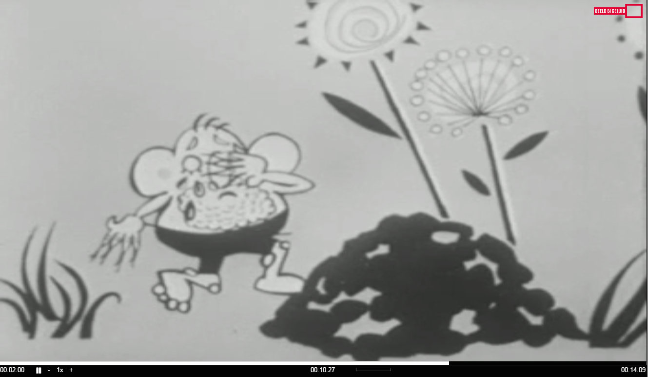
Uit Oma’s Kabinet, Het elfje en het aardmannetje, NCRV, 1962, Screenshot taken from the digitalised program at the Dutch Institute for Sound and Vision
The artistic demands of viewing time
The second characteristic that was implicitly mentioned in the intro is viewing time. The illustrations made by Johan Volkerijk are quite straightforward line drawings that are suited for black and white (and even for very low quality television sets). But they are also suited to be shown for a short while. Here we stumble upon a big difference with illustrated books. Since you can look at illustrations in a book for as long as you like, there are no restrictions as to how detailed an illustration can be, whereas onscreen, the image can only be shown for several seconds. The episode ‘Jozef: het kind van de dromen’ (Josef: the child of dreams), made for the series De Kinderen uit de Bijbel (The Children from the Bible, NCRV, 1984), shows how detailing an image is only possible for television in a certain way. This episode, brightly illustrated by Monaa van Vlijmen who also worked at the facility company (now called NOS), is illustrated in a period where most people had switched to colour television. The drawings that were made for this episode do have details, but these are all necessary to give a person or object shape, depth or shade. Other details such as flowers, birds or ornaments are not found. They are not relevant for the story and therefore left out in order to get the image across in a second. They may not look it, but every drawing is very well thought out.

De Kinderen uit de Bijbel, Jozef: het kind van de dromen, NCRV, 1984, Photo taken at the studio of illustrator Monaa van Vlijmen
Storyboarding on a timeline
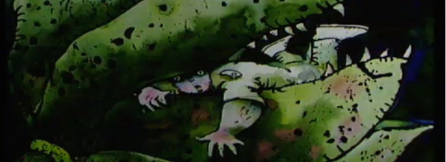
Since the start of Dutch television in 1951, a lot of stories have been told by means of illustration. Almost half of them were biblical stories, but other genres are found as well. One genre that isn’t found much in children’s television, but suits illustration very well is horror, since illustration can show much more gore than live-action television. Try to think of a live-action version of Family Guy and you immediately see why. ‘Het Griezeldomein’ (The Horror Domain) was an item in the youth program Donderslag (Thunderclap, AVRO, 1989). For this spooky item, children were encouraged to send in their own horror story. Henk Vermolen, another illustrator at the NOS, made drawings for these stories, and a vampire read them in a studio. On screen, the vampire and the drawings were shown alternately. This means that timing was very important to keep the drawings in sync with the story. Where an illustrated book has a certain amount of lines of text on one page and a drawing on the page next to it, on screen the text and images also have to match. This makes the timing of an illustrated item actually quite similar to how a children’s book is composed, only for television this had to be planned out with storyboards on a timeline.
Donderslag, Het Griezeldomein, AVRO, 1989, Screenshot taken from the digitalised program at the Dutch Institute for Sound and Vision
Last but not least, all mentioned programs show one very obvious difference with illustrated books, which is the 3:4 aspect ratio. For every book, the size is negotiable. Books can be square, elongated or even round or star-shaped, but for a long time, all television programs had to fit the same 3:4 television sets. Illustrators worked on several sizes of paper, and even with other aspect ratios (for instance when the drawing was meant for zooming and panning camera movements), but always had to keep the eventual aspect ratio of television in mind.
Donderslag, Het Griezeldomein, AVRO, 1989, Screenshot taken from the digitalised program at the Dutch Institute for Sound and Vision
Artistic quality
Television shows its medium-specific characteristics such as black and white, viewing time, timing and aspect ratio by demanding a specific way of illustrating programs. Although these aspects differ from books, they don’t make illustration impossible or reduce the quality of the illustrations. Drawings such as the ones made by Henk Vermolen show a strong artistic quality within the requirements of television. Just like the little fairy and goblin eventually married and lived happily ever after, television and illustration have also had a happy relationship that lasted for several decades.
You can see tv-illustration at work in these clips of ‘Dikkie Dik’, a very famous recurring item on the Dutch Sesamstraat (Sesame Street, NPS 1976-now) below.
© Grietje Hoogland and Leiden Arts in Society Blog, 2016. Unauthorised use and/or duplication of this material without express and written permission from this site’s author and/or owner is strictly prohibited. Excerpts and links may be used, provided that full and clear credit is given to Grietje Hoogland and Leiden Arts in Society Blog with appropriate and specific direction to the original content.
0 Comments